flex布局从懵逼到运用
本文包括了Flex布局的语法介绍,以及几种运用Flex布局实现的实例,涵盖了常见的使用场景。
一、Flex 布局是什么?
Flex 是 Flexible Box 的缩写,意为”弹性布局”,用来为盒状模型提供最大的灵活性。
任何一个容器都可以指定为 Flex 布局。1
2
3.box{
display: flex;
}
行内元素也可以使用 Flex 布局。1
2
3.box{
display: inline-flex;
}
Webkit 内核的浏览器,必须加上-webkit前缀。1
2
3
4.box{
display: -webkit-flex; /* Safari */
display: flex;
}
注意:设为 Flex 布局以后,子元素的float、clear和vertical-align属性将失效。
二、基本概念
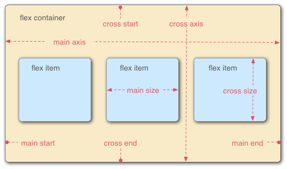
采用 Flex 布局的元素,称为 Flex 容器(flex container),简称”容器”。它的所有子元素自动成为容器成员,称为 Flex 项目(flex item),简称”项目”。
容器默认存在两根轴,水平的叫做 主轴(main axis),垂直的叫做 交叉轴(cross axis)。主轴的开始位置(与边框的交叉点)叫做main start,结束位置叫做main end;交叉轴的开始位置叫做cross start,结束位置叫做cross end。
项目默认沿主轴排列。单个项目占据的主轴空间叫做main size,占据的交叉轴空间叫做cross size。
三、容器的属性
1 | <div class="container"> |
以下6个属性设置在容器上1
2
3
4
5
6flex-direction
flex-wrap
flex-flow
justify-content
align-items
align-content
1. flex-direction属性决定主轴的方向(即项目的排列方向),有4个属性值
1 | .container { |
- row(默认值):主轴为水平方向,起点在左端。
- row-reverse:主轴为水平方向,起点在右端。
- column:主轴为垂直方向,起点在上沿。
- column-reverse:主轴为垂直方向,起点在下沿。
2. flex-wrap属性,默认情况下,项目都排在一条线(又称”轴线”)上。flex-wrap属性定义,如果一条轴线排不下,如何换行。可能取3个值
1 | .container{ |
- nowrap(默认):不换行。
- wrap:换行,第一行在上方。
- wrap-reverse:换行,第一行在下方。
3. flex-flow属性,是flex-direction属性和flex-wrap属性的简写形式,默认值为row nowrap
1 | .container{ |
4.justify-content属性,定义了项目在 主轴 上的对齐方式
1 | .container{ |
它可能取5个值,具体对齐方式与轴的方向有关。下面假设主轴为从左到右。
- flex-start(默认值):左对齐
- flex-end:右对齐
- center: 居中
- space-between:两端对齐,项目之间的间隔都相等。
- space-around:每个项目两侧的间隔相等。所以,项目之间的间隔比项目与边框的间隔大一倍
5.align-items属性,定义项目在 交叉轴 上如何对齐
1 | .container{ |
它可能取5个值。具体的对齐方式与交叉轴的方向有关,下面假设交叉轴从上到下。
- flex-start:交叉轴的起点对齐。
- flex-end:交叉轴的终点对齐。
- center:交叉轴的中点对齐。
- baseline: 项目的第一行文字的基线对齐。
- stretch(默认值):如果项目未设置高度或设为auto,将占满整个容器的高度。
6.align-content属性,定义了多根轴线的对齐方式。如果项目只有一根轴线,该属性不起作用。
1 | .box { |
- flex-start:与交叉轴的起点对齐。
- flex-end:与交叉轴的终点对齐。
- center:与交叉轴的中点对齐。
- space-between:与交叉轴两端对齐,轴线之间的间隔平均分布。
- space-around:每根轴线两侧的间隔都相等。所以,轴线之间的间隔比轴线与边框的间隔大一倍。
- stretch(默认值):轴线占满整个交叉轴。
四、项目的属性
以下6个属性设置在项目上。
- order
- flex-grow
- flex-shrink
- flex-basis
- flex
- align-self
1.order属性定义项目的排列顺序。数值越小,排列越靠前,默认为0。
1 | .item { |
2.flex-grow属性,定义项目的放大比例,默认为0,即如果存在剩余空间,也不放大。
1 | .item { |
如果所有项目的flex-grow属性都为1,则它们将等分剩余空间(如果有的话)。如果一个项目的flex-grow属性为2,其他项目都为1,则前者占据的剩余空间将比其他项多一倍。
3.flex-shrink属性,定义了项目的缩小比例,默认为1,即如果空间不足,该项目将缩小。
1 | .item { |
如果所有项目的flex-shrink属性都为1,当空间不足时,都将等比例缩小。如果一个项目的flex-shrink属性为0,其他项目都为1,则空间不足时,前者不缩小。
4.flex-basis属性,定义了在分配多余空间之前,项目占据的主轴空间(main size)
浏览器根据这个属性,计算主轴是否有多余空间。它的默认值为auto,即项目的本来大小。1
2
3.item {
flex-basis: <length> | auto; /* default auto */
}
它可以设为跟width或height属性一样的值(比如350px),则项目将占据固定空间。
5.flex属性是flex-grow, flex-shrink 和 flex-basis的简写,默认值为0 1 auto。后两个属性可选。
1 | .item { |
该属性有两个快捷值:auto (1 1 auto) 和 none (0 0 auto)。
建议优先使用这个属性,而不是单独写三个分离的属性,因为浏览器会推算相关值。
6.align-self属性,属性允许单个项目有与其他项目不一样的对齐方式.
可覆盖align-items属性。默认值为auto,表示继承父元素的align-items属性,如果没有父元素,则等同于stretch1
2
3.item {
align-self: auto | flex-start | flex-end | center | baseline | stretch;
}
该属性可能取6个值,除了auto,其他都与align-items属性完全一致。
flex布局练习代码:
HTML:1
2
3
4
5
6
7
8
9
10
11
12
13<div class="container">
<div class="item">1</div>
<div class="item">2</div>
<div class="item">3</div>
<div class="item">4</div>
<div class="item">5</div>
<div class="item">6</div>
<div class="item">7</div>
<div class="item">8</div>
<div class="item">9</div>
<div class="item">10</div>
<div class="item">11</div>
</div>
CSS:1
2
3
4
5
6
7
8
9
10
11
12
13
14
15
16
17
18
19
20
21
22
23
24
25
26
27
28
29
30
31
32
33
34
35
36
37
38
39
40
41
42
43
44
45.container {
width: 300px;
/* height: 400px; */
background-color: blanchedalmond;
display: flex;
flex-flow: row wrap;
/* 默认 */
justify-content: flex-start;
align-items: flex-start;
align-content: space-around;
}
.container .item {
display: flex;
align-items: center;
justify-content: center;
margin: 5px;
width: 50px;
height: 50px;
background-color: rgba(0, 0, 255, 0.315)
}
.container .item:nth-of-type(1) {
flex-grow: 7;
width: 100px;
height: 100px;
}
.container .item:nth-of-type(2) {
flex-shrink: 0;
/*flex-shrink为0时,即使空间不够,也不缩小*/
width: 100px;
height: 100px;
}
.container .item:nth-of-type(3) {
/* order: 1; */
flex-basis: 200px;
width: 200px;
height: 60px;
}
.container .item:nth-of-type(4) {
width: 30px;
height: 30px;
}
.container .item:nth-of-type(5) {
width: 70px;
height: 70px;
}
五、flex运用实例
- 如何使用flex布局绘制筛子的6个面?
网格布局
圣杯布局
输入框组件的布局
悬挂式布局
固定的底栏
流式布局
未完待续…
原文:阮老师的博客